Five Victorian Terrace Palettes That Look Right Without Turning Your Home Into a Museum
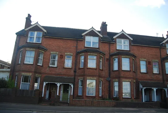
Photo: N Chadwick , CC BY-SA 2.0, via Wikimedia Commons
The Victorian terrace is a funny thing to decorate. It is the most common period home in Britain, but it is rarely grand. The rooms are often narrow, the ceilings are high, the hallways are dark and the original features are a mixed bag of cornices, ceiling roses, fireplaces and whatever previous owners did in the 1980s. The temptation is to go full heritage: deep greens, browns, brass and a house that feels like a National Trust property where you are not allowed to sit down.
That is not the only way. A terrace can look period-plausible without being preserved in aspic. The trick is to choose colours that respect the proportions and the light, then let the modern stuff be modern. Here are five palettes that do that, each with walls, trim, ceiling and front-door colours, plus the undertones and lighting notes that matter in a typical terrace.
Palette 1: Plaster, Stone and Olive
Walls: a warm plaster pink or soft off-white with a red-yellow undertone. Trim: a soft stone or aged linen white. Ceiling: the same plaster tone, one shade lighter. Front door: a muted olive green.
This is the palette for a north-facing terrace that never quite warms up. The plaster tone is not pink in a sugary way; it is the colour of old lime plaster, with enough warmth to stop the walls looking grey. The olive door adds a period-friendly note without shouting. Keep the trim off-white rather than brilliant white, and paint the cornice the same as the ceiling so the detail reads as architecture rather than decoration.
Lighting note: this palette works best with warm white bulbs and lamps that cast light upwards. In a south-facing room it will feel soft rather than sugary; in a dark hallway it will feel like a gentle lift.
Palette 2: Sage, Linen and Ink
Walls: a muted sage green with a grey edge, not a bright herbal green. Trim: a linen off-white. Ceiling: a pale green-tinted white. Front door: ink black or a very dark blue-black.
Sage is everywhere for a reason: it is forgiving, it suits period proportions and it looks good in both natural and artificial light. The grey edge keeps it from feeling cottagey, which matters in a terrace that is more urban than rural. The ink door gives the facade a crisp, Victorian shopfront feel without going full gloss.
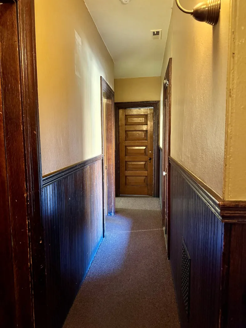
Lighting note: this palette is happiest in east or west-facing rooms where the light moves across the walls. In a north-facing room it can feel cool, so lean towards a sage with a touch of yellow rather than a blue-grey sage. In a narrow hallway, consider painting the walls and ceiling in the same sage to blur the edges and make the space feel less tunnel-like.
Palette 3: Terracotta, Chalk and Oxblood
Walls: a muted terracotta, dusty rather than bright. Trim: a chalky off-white. Ceiling: a warm white with a faint pink undertone. Front door: oxblood red.
This is the palette for a dining room or a front reception room that gets decent light. Terracotta is period-plausible without being a cliche, and it flatters wood furniture, brass and old floorboards. The oxblood door is a classic Victorian choice that still feels confident today. Keep the ceiling warm and simple; a stark white will make the terracotta look chalky and flat.
Lighting note: terracotta has red and orange undertones, so it can feel intense in a north-facing room with no direct sun. Use it where you get some warmth, or keep it below the picture rail and use a softer plaster above. In a narrow room, paint the ceiling the same warm white as the trim to stop the space feeling chopped in half.
Palette 4: Blue-Grey, Cloud and Navy
Walls: a blue-grey with a good amount of grey in it, not a nursery blue. Trim: a cloud white. Ceiling: a pale blue-white. Front door: navy.
Blue-grey is the palette for a south or west-facing terrace with good afternoon light. It feels calm and slightly formal, which suits a Victorian hallway or a sitting room with a bay window. The navy door is a safe period choice that looks smart against London stock brick and painted stucco alike. The key is to keep the blue-grey muted; a saturated blue will make the room feel smaller and colder.
Lighting note: north-facing rooms can make blue-grey look grey and slightly sad. If you love the colour, choose a version with a hint of green or warm grey, and test it on a large board before you commit. In a dark hallway, a blue-grey below the dado rail with a cloud white above can look sharp without closing the space down.
Palette 5: Butterscotch, Bone and Black
Walls: a soft butterscotch or ochre with a brown undertone, not a bright yellow. Trim: bone or old white. Ceiling: a warm white. Front door: black.
This is the cosy option for a north-facing living room or a terrace that needs a bit of sunshine on a grey day. Butterscotch is period-friendly because it echoes old ochre and distemper colours, but it feels warmer and more modern than a heritage mustard. The black door is a classic Victorian contrast that makes the facade look intentional rather than neglected.
Lighting note: yellow-based colours can go green in cool light, so test this one carefully. A butterscotch with a brown or red undertone is safer than a clean yellow. Use it in rooms where you want to feel wrapped up in the evening, and keep the ceiling warm white so the room does not feel like a pub.
How to sample in a narrow, high-ceilinged room
Victorian terraces are not showrooms. The light changes from the front bay to the back extension, the ceilings are high enough that the upper walls sit in shadow, and the hallway is usually darker than the room you are standing in. A small painted patch on the wall will tell you almost nothing.
Paint A2 boards with two coats and move them around the room. Hold them at eye level, then up near the cornice, then down by the skirting. Look at them from the doorway, because that is how you actually see the room. Test the wall colour next to the trim colour and the ceiling colour, not in isolation. In a narrow hallway, tape a board to the wall and see how it looks against the opposite wall; strong contrast can make a corridor feel choppier, while a closer tone can make it feel wider.
Test at different times of day and with the lamps you actually use. If you have warm bulbs, test with warm bulbs. If the room is north-facing, test on a grey day. And check the colour against the floor, the fireplace and any original tiles, because a palette that looks perfect on a colour card can clash with the fixed elements you cannot change.
Finally, do not be afraid to break the palette. The best terraces are not period sets; they are homes where someone has added a modern sofa, a bad painting and a radiator that does not match anything. The colours should hold the architecture together, not turn the house into an exhibit.