The Hallway Colour Reckoning: What Actually Works in Britain’s Narrow, Gloomy Corridors
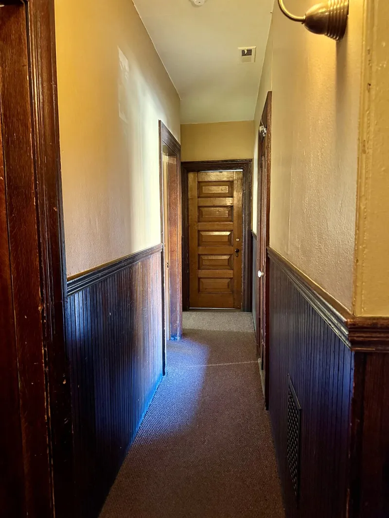
Photo: w_lemay, CC BY-SA 2.0, via Wikimedia Commons
Every British hallway has a story, and most of them involve a forgotten coat hook, a pile of post and a shade of beige that nobody actively chose. In 2026, with more of us working from home at least part of the week, the corridor has stopped being a pass-through and started being a room. Which means it deserves better than the leftover paint from the kitchen.
But hallways are also the hardest spaces in the house to colour confidently. They are often narrow, they are usually north-facing, and they frequently have less natural light than a cupboard. So we did the obvious thing: bought sample pots from Farrow & Ball, Little Greene and Coat, painted them onto A3 lining paper, and taped them to the walls of three very different UK hallways. This is what happened.
Why hallway colour is a different beast
A hallway is not a living room with the sofa removed. It is a transition zone, a storage zone and, in many UK homes, a thermal shock zone. It gets scuffed by shoes, brushed by coats and lit by whatever bulb the last occupant left behind. Colour behaves differently here because the light is different: weaker, cooler and more changeable across the day.
That matters because paint chips lie. A soft grey that looks elegant on a big sample in a bright kitchen can turn flat and dingy in a north-facing corridor. A rich green that feels brave in the shop can go almost black by 4pm in November. The only reliable test is to put the colour in the actual hallway and look at it in the morning, at lunchtime and under the light you actually use in the evening.
The test: three homes, one grey afternoon
We tried the same set of shades in three hallways: a Victorian terrace in Leeds with high ceilings and a glazed door at the far end; a 1930s semi in Bristol with a narrow corridor and a small side window; and a modern new-build flat in Manchester with no natural light at all and a cool white LED bulb. Not exactly a laboratory, but close enough to the realities of British housing.
The sample pots came from Farrow & Ball, Little Greene and Coat. We looked at pale neutrals, warm pinks, soft greens and deep blues, because those are the shades homeowners keep asking about. We painted two coats onto lining paper, taped the sheets at dado height and near the ceiling, and left them up for a week. Then we asked the least sentimental question of all: would we actually live with this?
What the sample pots told us
Farrow & Ball: beautiful, moody, occasionally sulky
Hague Blue was the drama queen of the group. In the Victorian hallway it looked extraordinary — deep, greenish-blue and almost velvety — but only because the ceiling was high and the glazed door threw in enough light to keep it from collapsing into black. In the new-build corridor it was too much: handsome, but heavy, like wearing a winter coat indoors. Cromarty, by contrast, was the quiet hero. That pale grey-green held its colour in low light and made the narrow 1930s hallway feel calmer without going cold. Setting Plaster was lovely in the Bristol semi, where its pink undertone warmed the space, but it looked slightly washed out in the Manchester flat under the cool LED.
Little Greene: the quiet overachiever
Little Greene’s French Grey and Slaked Lime both did well in the awkward middle ground between too pale and too dark. They have enough pigment to avoid the dreaded greyish wash but enough softness to keep a small hallway from feeling like a tunnel. Pearl Colour was particularly good near the ceiling, where it bounced what little light there was without looking stark. If you want a hallway that feels considered rather than decorated, this is the zone to shop in.
Coat: the new-build friendly rebel
Coat’s colours felt more contemporary and a little more forgiving of modern lighting. Good Intentions, a warm neutral, stopped the new-build corridor from feeling like a dentist’s waiting room. Rebel, a deep green, worked brilliantly on a single alcove wall in the Victorian terrace, where it added depth without swallowing the whole space. Pink Noise was the surprise: a soft pink that looked cheerful in the 1930s hallway and less saccharine than expected, especially against white trim.
The UK light problem
British light is not one thing. A hallway with a north-facing window is not the same as a hallway with no window, and a Victorian terrace with a fanlight is not the same as a new-build flat lit by a cool white bulb. In practice, that means three rules.
First, warm undertones are your friend. Icy greys and blue-whites can go grim in low light. Second, test at both ends of the hallway, because the colour will look different near the door and near the stairs. Third, pay attention to your bulbs. A warm white bulb will make almost any colour feel softer; a cool white LED will make greys look colder and pinks look cleaner. If you are not changing the lighting, choose the paint for the light you have.
Palettes that work: Victorian, 1930s and modern
Victorian terrace
Lean into the architecture. A soft grey-green such as Cromarty or Slaked Lime on the walls, an off-white ceiling, and a deeper blue or green on the dado rail and skirting will give the hallway a sense of structure. If you have original tiles, let them lead. If you do not, a deep shade below the dado can add Victorian drama without making the whole corridor dark.
1930s semi
These hallways are often narrower than they look on the floor plan, so keep the main walls light and warm. Setting Plaster, Good Intentions or a soft French Grey will stop the space feeling like a corridor and start it feeling like a room. Use a stronger colour on the front door inside, or on a single panel, if you want a hit of personality without shrinking the space.
Modern new-build
New-build hallways often need help. There is little period detail to lean on, and the light can be flat. Choose a warm neutral for the walls, then use colour on the trim, inside an alcove or on the inside of the front door. Coat’s Rebel or a deep blue works well as a deliberate accent, but keep the ceiling bright and the lower walls practical. A washable matt emulsion is not glamorous, but it is sensible.
The practical bit: finish, prep and test pots
Hallways take more punishment than any other room. Use a durable emulsion on the walls and an eggshell on the trim, especially if you have children, dogs or a bike that lives indoors. Avoid chalky flat matt below waist height unless you enjoy touching up. If you are painting over old gloss, sand and prime first; if you are painting over a dark colour, use a good blocking primer.
And please, use a proper sample. Paint a large sheet, tape it up, and live with it for a few days. The hallway will tell you the truth.
The verdict
For dark, narrow corridors, the safest wins are warm mid-tone neutrals and soft grey-greens. They keep the space from feeling like a cave without pretending the light is better than it is. Deep colours can work beautifully, but they need intention: a high ceiling, a glazed door, a deliberate accent wall or a hallway that is wide enough to carry the drama. In 2026, the best hallway colour is not the boldest one. It is the one that still looks good when you come home in the rain.