Look Up: The Ceiling Colours That Actually Earn Their Keep in UK Homes

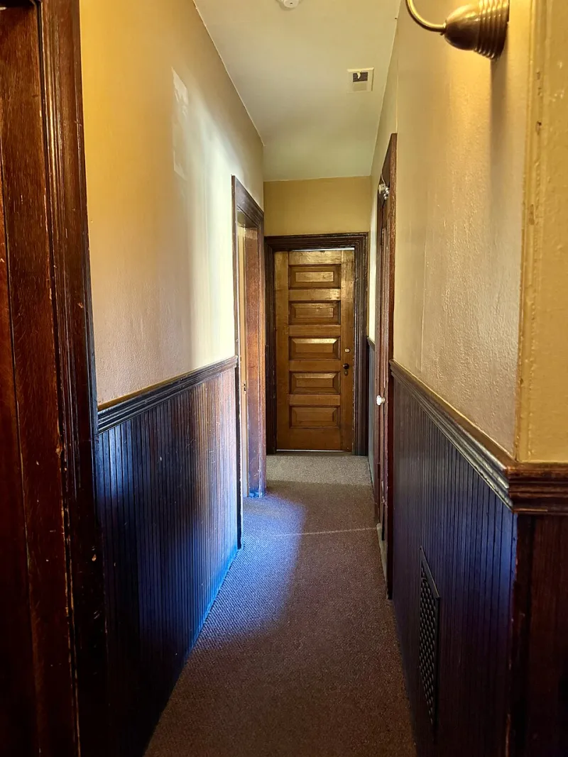
Photo: Jorge Royan, CC BY-SA 3.0, via Wikimedia Commons
We are a nation of wall-paint people. We agonise over whether the sitting room should be a soft green or a dirty pink, then reach for the same tub of brilliant white the moment the ceiling comes into view. It is the fifth wall, and most of us treat it like a default setting rather than a design decision.
That is a mistake in any home, but especially in Britain, where light is not a given and ceiling heights are all over the place. A ceiling colour can make a low new-build room feel less boxy, soften a north-facing bedroom that never quite warms up, or let the cornice in a Victorian terrace do the talking. It can also make a room feel like a rental inspection. The difference is usually not the colour itself but whether it was chosen for the room.
Why British light changes the answer
In a sunny climate, a crisp white ceiling is a sensible reflector. In the UK, it can be a cold comfort. Our daylight is often weaker, flatter and bluer than the light in paint brochures, particularly in north-facing rooms and in the narrow middle bits of terraces that never see direct sun. Brilliant white in that context can read grey, especially once it is up on a ceiling that gets less direct light than the walls.
A warmer off-white, or a white with a faint yellow or red undertone, tends to hold its own in British rooms. It bounces what light there is back into the space without making everything look yellow. That is the balance to aim for: warmth without butter, brightness without a blue cast.
Ceiling height matters just as much. A standard new-build ceiling of around 2.4m is not the place for a deep charcoal unless you are deliberately creating a cocoon. A Victorian terrace with 2.7m or 3m ceilings can carry more colour overhead, especially in a dining room or snug where a darker ceiling makes the room feel contained rather than cavernous. In a narrow hallway, though, a heavy ceiling can feel like a lid.
Victorian terraces: let the architecture speak
Period homes usually have the best ceiling details, and the colour should not fight them. In a terrace with cornicing, a ceiling rose or deep coving, a soft off-white with a little warmth is the safest and often the most flattering choice. Something in the region of a plaster or pointing white works well: it is clean without being clinical, and it lets the mouldings cast their own shadows.
If the room gets good light, you can afford a subtle tint overhead: a pale pink, a dusty green or a very soft stone. It will barely register as a colour, but it stops the ceiling feeling like a separate white lid. In north-facing reception rooms, lean warmer rather than cooler. A grey-tinted white that looks elegant in a south-facing showroom can turn grim in a terrace that faces the wrong way.
The cornice is the tricky bit. Painting it the same colour as the ceiling is usually the most architectural move, because the detail reads as part of the ceiling plane. Painting it the same as the woodwork gives a crisper, more decorative look. Either can work; what rarely works is leaving the cornice brilliant white while the ceiling is a warm off-white and the walls are sage. That is how you get a room that looks like it was painted in stages by three different people.
New-builds and low ceilings
New-build ceilings are often low, flat and interrupted by bulkheads, downlights and extractor ducts. The goal here is not to draw attention to them. A warm white is the obvious answer, but it needs to be a warm white with some depth, not the coldest white on the colour card. If the ceiling has awkward changes in level, painting the walls and ceiling in the same light mid-tone can blur the edges and make the room feel taller than it is.
Dark ceilings can work in new-builds, but they need a reason: a small dining room, a snug, a bedroom where you want a cave-like feel. In a low living room with a standard window, a dark ceiling usually just lowers the room further. If you want to try it, keep the walls pale and the finish matt so the ceiling recedes rather than shines.
Rented flats: permission first, compromise second
In a rental, the ceiling is often the one surface you cannot change without a conversation. Check your tenancy before you buy a sample pot. If painting is allowed, a warm white or a pale tint is the sensible choice: it improves the room without making the checkout inspection interesting. If it is not allowed, you can still warm the ceiling visually with lamps that cast light upwards, and by avoiding cool-toned bulbs in the rooms where you spend the most time.
If you are allowed to paint but want to keep things reversible, stick to a neutral ceiling and put the personality on the walls or in the lighting. A dramatic ceiling is harder to undo than a feature wall, and it is the first thing a future tenant will stare at while lying in bed.
A simple testing method
Do not test ceiling colour with a tiny dab on the wall. Paint two large A2 boards with two coats of your candidate colour and leave them to dry properly. Hold them up against the ceiling at different times of day, and look at them from the doorway as well as from underneath. Check them next to the cornice, the woodwork and the floor, because a ceiling colour changes depending on what it is sitting above.
Test in the morning, late afternoon and at night with the lamps you actually use. If you have warm bulbs, test with warm bulbs. If the room is north-facing, test on a grey day, because that is when the colour has to earn its keep. And test the finish as well as the colour: a matt emulsion is usually the right default for ceilings, but bathrooms and kitchens need something more moisture-resistant.
Common mistakes to avoid
- Assuming brilliant white is neutral. In a British north-facing room it can look grey, cold or slightly blue.
- Matching the ceiling exactly to the walls without thinking. Sometimes it creates a seamless, taller-looking room; sometimes it makes the space feel flat.
- Putting a dark colour on a low ceiling because it looked good in a photograph of a loft apartment.
- Using silk or gloss on an uneven ceiling. Sheen highlights every lump, patch and hairline crack.
- Forgetting to prime over old stains, nicotine or patches. No topcoat can hide a ghost.
- Ignoring the cornice. The ceiling colour and the trim colour have to make sense together.
A ceiling is not the place for a wild experiment unless you have the height and the light to carry it. But it is absolutely the place for a deliberate choice. Warm off-white, soft plaster, a pale tint, a deep colour in the right room: the fifth wall deserves better than whatever was left in the garage.