Where Daylight Enters: Colouring Window Reveals, Sills and Shutters
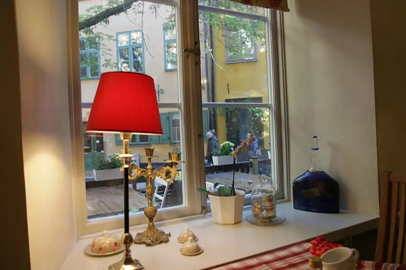
Photo: Øyvind Holmstad, CC BY-SA 4.0, via Wikimedia Commons
Most of us spend weeks choosing a wall colour and about four minutes thinking about the window. The reveal — that little return of wall between the glass and the room — gets a cursory coat of whatever white was left in the tin, the sill gets wiped down, and the frame is left to whatever the window fitter specified. It is understandable. The reveal is small, awkward to paint, and usually half-hidden behind a curtain. But it is also the surface that daylight grazes across on its way into the room, and that makes it quietly powerful.
The smallest wall in the room, doing the most work
Think about how light actually arrives. It comes through the glass, hits the splay of the reveal, and bounces off at an angle. If the reveal is bright white, it throws a hard, cool edge into the room and makes the window opening read as a bright rectangle punched into the wall. If it is closer to the wall colour, the opening softens and the window feels like part of the architecture rather than a hole in it. If it is darker than the wall, the reveal recedes, the glass appears deeper, and the wall around it seems to lift. None of these is wrong. They are just different decisions, and most of us make them by accident.
There is a practical dimension too. Reveals are usually the coldest surface in a room — they are thin, they sit next to glass, and in older British homes they are often the first place condensation gathers on a January morning. Whatever you put on them needs to cope with that.
Whites are a decision, not a default
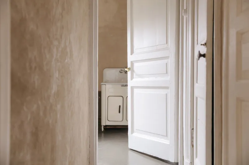
Builder white on a reveal is not neutral. In a north-facing room it tends to go grey; in a kitchen it picks up the green cast of the garden; under a warm bulb it turns cream without asking. Pure brilliant white is the harshest option and the least forgiving of uneven plaster.
A softer approach is to take the wall colour and step it down — same hue, a shade or two deeper — so the reveal reads as shadow rather than as a separate element. This works particularly well with the mid-tone greens, clays and off-blacks that have been popular in British interiors lately. The window becomes a quiet recess, and the room feels calmer for it.
If you want the window to disappear into the wall — a good move in small rooms and awkward corners — match the reveal exactly to the wall and carry the same colour onto the architrave. The trade-off is that dirt and scuffs show more on a mid-tone, and any filler in the corners will need to be neat.
The frame is not the reveal
It is worth separating the two. The frame, or sash, is a piece of joinery; the reveal is plaster. They do not have to be the same colour, and in period homes they often should not be. A dark frame against a pale reveal gives you crisp definition and a slightly gallery-ish feel; a frame matched to the wall gives a softer, more enveloping result.
For sash windows in Victorian and Edwardian terraces, the traditional approach — dark exterior, white interior — still works, but the white does not have to be brilliant. An off-white eggshell on the sashes and a related but slightly warmer tone on the reveal will look more considered than the standard fitter's white, and it hides the inevitable marks from window cleaning.
Room by room, without overthinking it
Living rooms can take a reveal that is darker than the wall. It makes the view out feel framed and gives south-facing rooms a bit of depth in the evening.
Bedrooms benefit from a reveal that is close to the wall colour, especially if you have blackout blinds or heavy curtains. A bright white sliver at the edge of the window is the first thing you see at 5am in June.
Kitchens and bathrooms need a scrubbable finish on the sill and reveal. Moisture-resistant emulsion is the minimum; a water-based eggshell is better. Avoid chalky or lime-based paints right next to the glass unless the room is well ventilated, because they do not enjoy repeated wetting.
Hallways and stairwells often have narrow reveals that catch almost no direct light. Painting them the same colour as the wall stops them looking like grubby little slots.
Condensation, UV and old glass
Two practical warnings. First, condensation. If your windows stream with water every winter, the reveal paint will fail before the wall paint does. Fix the ventilation before you fix the colour. A bead of mould-resistant sealant at the junction of sill and reveal, and a paint designed for bathrooms, will buy you time.
Second, UV. South-facing rooms fade everything, and reveals get more sun than most walls. Deep colours with poor lightfastness will shift; reds and some yellows are the usual culprits. If the window is original and you are using a traditional oil or linseed paint, expect it to chalk and move. That is part of the deal, and it is kinder to old timber than a plastic film.
If you are in a listed building or a conservation area, check before you change exterior colours. Interior reveals are usually fine, but sashes visible from the street are not always yours to repaint however you like.
If you rent
The reveal is one of the few surfaces a renter can usually improve without asking, provided you are careful. Painting a scuffed white reveal in a close match to the wall is low-risk and easy to reverse. Do not touch the frames if they are uPVC, and do not paint over the seals. If you want the look of a coloured frame without the commitment, paint the reveal instead. It reads from inside the room in much the same way and comes off with a coat of white before you leave.
A small method
Tape a sample of your chosen colour to the reveal and live with it for a week, checking it at breakfast, at dusk and with the light on. Reveals are awkward to paint and easy to get wrong by eye, because they are lit at a glancing angle and always look deeper than the same colour on a flat wall. Two coats of a decent eggshell, a neat line where the reveal meets the frame, and a wiped sill will do more for a room than most people expect from such a small surface.
The window is where the outside comes in. It is worth giving it an edge that you chose on purpose.