The Fifth Elevation: Choosing Interior Colours That Hold Up When Viewed From the Lawn

Photo: Bernard Samuel Fenn, Public domain, via Wikimedia Commons
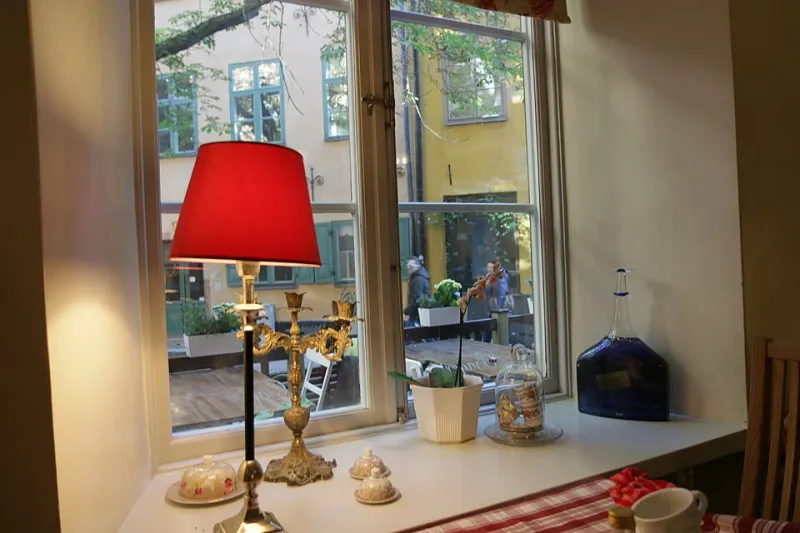
Stand at the far end of a British garden in November, turn around, and your house stops being a home and becomes a composition. The windows are the apertures. The rooms behind them are the picture. It is a view most of us never properly audit, because we choose colours standing inside the room with a cup of tea and a sample pot, then spend the next five years looking out. The garden looks back at a different scheme entirely.
Two audiences, one wall
An interior wall has two jobs. Inside, it has to flatter your furniture, cope with the light from the window and make you feel something when you walk in. Outside, viewed through glass from ten or fifteen metres away, it has to do something much simpler and much harder: it has to read as a considered shape rather than a random patch of colour. Distance strips out nuance. The subtle und undertone you spent three weekends choosing is largely invisible from the patio. What survives is value — how light or dark the wall is — and temperature — whether it reads warm or cool against the brick, render, sky and shrubs around it.
What the planting does to a wall colour
A garden is not a neutral viewing gallery. In summer, mature shrubs and lawn cast a greenish light back towards the house, which can push yellow-based creams towards lime and make cool greys look slightly sour. In winter, bare branches and wet paving do the opposite: they darken the foreground and make the window opening look brighter by contrast. Red brick reflects warmth onto adjacent surfaces; white render bounces cool light; a grey sky flattens saturation like a giant softbox. If your room is already north-facing, the view from outside is often the first place you notice that the colour has gone muddy.
The brick-and-render variable
UK homes are unusually varied at this scale. A London stock brick terrace, a pebbledashed semi in the suburbs, a white-rendered cottage and a red-brick Victorian all frame the same interior colour differently. The reveal of the window — the depth of wall between glass and room — acts like a small stage set. If the reveal is dark and the room behind is brilliant white, the window reads as a hard, flat rectangle. If the room is a deep olive and the brick is warm red, the two can merge into a pleasant shadow. Neither is wrong; the mistake is not noticing the relationship at all. A cool blue-grey behind warm brick often looks deliberate from inside and slightly chilly from the lawn. A clay pink behind grey render can look like a smudge unless the room inside has enough warm lamplight to carry it.
The evening turn
At dusk something shifts. With lamps on and daylight fading, the window stops being transparent and starts being a lantern. Pale walls glow softly and make the house look inhabited. Very dark walls can become black voids, especially if the room behind is unlit or the curtains are drawn. If you love a deep colour — a forest green, a navy, a near-black — the lawn view is worth considering before you commit. It can look wonderfully moody from inside and, from outside, like a missing pane. The fix is rarely to abandon the colour. It is usually to add a warm lamp, a lighter ceiling or a pale blind that catches the light and gives the window a second, softer reading after dark.
Bifold doors and the long view
Bifold doors and wide patio openings change the maths. When the doors are open, the interior wall becomes a backdrop to the garden rather than a framed picture. The threshold disappears, and whatever colour sits on the far wall is suddenly part of the planting scheme. This is where interior colours that echo foliage — muted sage, olive, a soft moss — can feel seamless rather than themed. It is also where a strong accent wall can become a stripe across the view. The test is simple: stand in the garden with the doors open and squint. If the wall reads as a calm continuation of the garden, it will probably work. If it reads as a billboard, it may need to be quieter, or at least balanced by a lighter ceiling and floor.
A proper lawn test
You do not need scaffolding to check this. You need a few hours, some decent sample boards and a willingness to look slightly odd to the neighbours.
- Paint two or three A2 boards in your shortlisted colours, two coats, in the finish you intend to use. Fix them temporarily to the actual wall where the colour will live — not held at arm's length in the middle of the room.
- View each board from three distances: two metres inside the room, five metres outside on the patio, and ten to fifteen metres from the end of the lawn. The far view is the one that matters most and the one almost nobody does.
- Repeat the exercise on a flat grey day and on a low-sun day. In winter, also check at 4pm and again at 8pm with the lamps on. British light is not one condition; it is a rotating cast of them.
- Clean the window before you judge. Dirty glass adds a grey film that can make a warm colour look dull and a pale colour look tired.
- Take phone photographs at eye level, then switch to black and white. This strips out the colour debate and shows you the value contrast between wall, window frame, brick and sky. If the wall and the window frame are the same tone, the opening will disappear.
Colours that tend to survive the view
Warm off-whites with a touch of yellow or red tend to read as a soft glow from the lawn, especially in evening light. Muted olive and sage can work beautifully against planting, but they need enough contrast with the window frame to avoid merging. Clay, terracotta and muted ochre hold their own against red brick and look generous at dusk. Deep blue-green and charcoal can be excellent if the room has good lamps and a pale ceiling to stop the window becoming a hole. Brilliant white is the one to treat with suspicion: it can glare from outside and flatten to grey from inside. Pale greys often disappear entirely from ten metres away, which is fine if you wanted a quiet window and less fine if you wanted a scheme.
The view from the garden is not the only view that matters, but it is the one your house presents to the world every day. A colour that works from the lawn as well as the sofa is not a compromise. It is a scheme that has been properly looked at, from both sides of the glass.