Handle With Care: Why Your Interior Doors Deserve Better Than Builder White
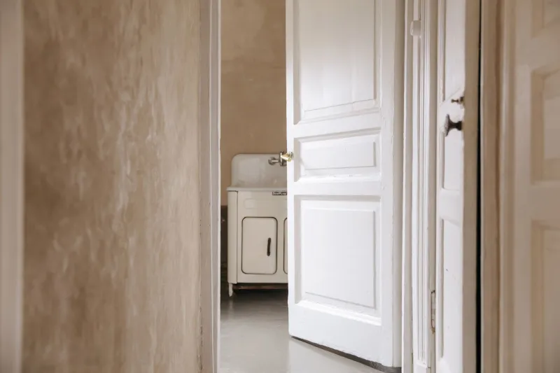
There's a particular off-white that has colonised British hallways. You know the one. It's on every door in the rental, every door in the new-build, and most of the doors in the period terrace that's been "done up" at some point since the millennium. It's a perfectly decent colour. It's also the reason so many hallways feel like the corridor of a dental surgery rather than the inside of somebody's home.
Interior doors take more punishment than any other painted surface in the house. You push them with a shoulder when your hands are full, hook a finger round the latch, nudge them with a hip, wipe them with a cloth when something has spilled. A wall gets looked at. A door gets used. And yet it's normally the last thing anyone thinks to give a colour to, which is a strange oversight given how cheaply and quickly a door can be transformed.
A door is a small commitment with a big presence
Most of us have between four and eight interior doors. That's a lot of painted rectangles. In a hallway, they set up a rhythm — a run of five doors down a corridor reads as repetition, and repetition is exactly what makes colour feel intentional rather than random.
Leave them all white and the rhythm is silence. In a small flat, a row of white slabs starts to look like blanks waiting for something. Paint them all the same colour and the hallway suddenly has a beat. It's not about being bold; a soft grey-green on five doors is hardly a provocation. It's about the fact that the eye notices a pattern and relaxes into it.
Doors also get seen from both sides, which is why people overthink them. A door is the only surface in the house that has to hold its own in two different rooms, sometimes two different schemes. That's the real argument for choosing the colour once and letting it travel.
Three verdicts on matching
Same colour as the walls, different finish. This is the option most people should consider first and consider hardest. Pick up the wall colour in an eggshell and the door melts into the room, which is lovely in a small bedroom or a north-facing hall where you don't want another edge to look at. It's also the most rental-friendly version, because it reads as calm rather than as a decision. The finish difference does the work: matt walls, low-sheen door, no shadow line where the frame meets the plaster.
Same colour as the architraves and skirting. The safe, traditional, faintly institutional option. It keeps the woodwork speaking as one family and it never looks wrong. It also never looks like much, and in a house where the trim is a slightly tired white it can drag a good wall colour down with it.
A colour of its own. This is the move worth arguing for. A mid-tone door — sage, ochre, a dusty oxblood, a deep blue-grey — gives a hallway a spine. It works best when it's repeated across every door in sight, because a single contrasting door starts to look like a mistake or a spare from another room. Choose something half a shade deeper than the walls, or something from the same family as a fabric or a rug in the adjoining room, and it will read as deliberate every time.
Old panels, older habits
Victorian houses tend to give you four panels: two long, two short, with mouldings deep enough to catch a shadow. Nineteen-thirties semis usually offer three, with a wide top panel and a smaller pair beneath. Both are lovely, and both punish a careless paint job.
Two things matter more than the colour. First, preparation. Old gloss on top of older gloss needs keying back or the next coat will sit there like a rumour and flake off within a winter. Bare pine wants a primer and a knotting solution on the knots, or you'll be looking at amber stains through your beautiful new green by February. Second, the mouldings. A brush that's too big will bridge the profile and fill the shadow, which is where half the character of a panelled door actually lives. A small brush, thin coats, and a light sand between them will do more for the finish than any brand on the tin.
There's also the dent question. Dark colours on old doors show every filled knock and every lump of old paint. That's not a reason to avoid them; it's a reason to sand properly and to avoid a high gloss. A mid-sheen mid-tone is far kinder to a door with a history than a navy gloss.
The finish that survives a family
Traditional oil gloss looks wonderful for roughly eleven minutes and then collects every fingerprint in the postcode. It also yellows, which is why so many "white" doors in older houses are quietly cream.
Modern water-based eggshells and satins are the sensible answer. They're tough, they don't yellow, they clean up with water, and the better ones are genuinely scrubbable. A mid-sheen finish is the sweet spot: enough sheen to wipe down, not so much that it acts like a mirror for every thumb.
Dark colours with a sheen are the worst offenders for showing marks. Very flat matt is the worst for scuffs. If you want depth without the maintenance, aim for a mid-tone with a low-to-mid sheen, and paint the latch edge — the strip you actually grab — in the same finish so it can be wiped.
Don't stop at the slab
The door is not just the door. The architrave, the frame, the edge that faces the hall, the top edge (do it, especially on a bathroom door), the strike plate, the hinges and the little wall patch behind the handle where everyone's knuckles land all contribute. Paint the whole assembly, or the contrast door will look like a rectangle floating in a frame that belongs to somebody else.
One practical note: a freshly painted door needs a day before it's shut firmly. Budget for it, or you'll be the person peeling a perfect finish off the rebate with a fingernail.
The accident test
Stand in the room and look at what you can see at once. If three doors line up down the hall, they're a composition, and they should agree with each other. If one contrasting door sits next to a contrasting front door, that's a scheme. If one door is a different colour from the other four and nothing else in the room backs it up, it will read as a leftover every single time.
The test is simple: does the door colour appear anywhere else in the space, even in a small way? A book spine, a lampshade, a tile, the rug. If yes, it's a decision. If no, it's a coincidence, and coincidences in hallways are rarely flattering.
A door is small enough to risk and large enough to matter — which is a rare combination in decorating. Buy a sample pot, paint the latch edge first, live with it for a week, and then commit. Builder white has had its turn.