Beyond the Swatch: How Paint Finish Quietly Decides Whether Your Colour Works

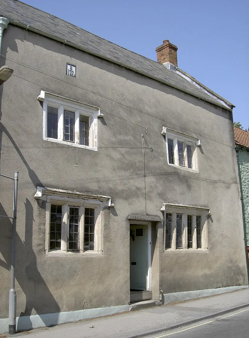
Photo: Iamvivekkj, CC BY-SA 4.0, via Wikimedia Commons
There's a particular kind of decorating disappointment that has nothing to do with getting the colour wrong. You matched the tester perfectly, you bought the tin, you painted the wall — and somehow the room looks flatter, cheaper or just slightly off. Nine times out of ten the culprit isn't the hue. It's the finish.
Sheen changes how a colour reads. It changes how much light bounces off a wall, how visible the lumps in old plaster become, and how grubby the whole thing looks after a winter of wet coats and muddy boots. In a country where the light is soft, grey and frequently underwhelming, that matters more than it does in a sun-drenched showroom photo.
So before you commit to a colour, commit to a sheen. Below is how each one tends to behave in real UK homes.
Why sheen is really a light decision
A matt wall swallows light. A silk wall throws a slice of it back at you. Under the flat, cool light of a north-facing sitting room, that difference is the gap between a rich, velvety mid-grey and a slightly plasticky one. Under a warm south-facing window, a silk finish can glow beautifully for about two hours a day and look a bit slick for the rest of it.
Gloss level also exaggerates. Every ripple in old plaster, every filled crack, every bit of patched-in lining paper — a shinier paint turns the torch on all of it. Matt does the opposite: it softens, blurs and forgives. That's why period homes, with their wonky walls and wavy ceilings, tend to look better in flatter paints, and why a crisp modern flat with laser-straight plaster can carry a soft sheen without embarrassment.
Matt: the forgiving one, not the boring one
Matt emulsion is the default for a reason. It's the most flattering option for imperfect walls, it holds deep and chalky colours best, and it lets a room feel calm rather than clinical. On ceilings it's more or less the only sensible answer, since nobody wants a reflective surface directly above their head at 11pm.
Where it earns its place:
- Living rooms and bedrooms, especially in older properties with textured or slightly tired walls
- Ceilings, always
- Feature walls where you want maximum depth from a dark or saturated colour
- Period properties where the plaster has opinions
The catch is durability. Standard matt emulsion marks if you look at it sharply, and it doesn't love being scrubbed. If you're painting a hallway or a child's bedroom, look for a washable matt — sometimes sold as a scrubbable or durable matt — which keeps the flat look but survives a sponge. Contract matt, the budget stuff used on new-builds, is best avoided anywhere you actually live; it's designed for speed and cost, not for wiping down.
Eggshell: the quiet workhorse
Eggshell is the finish most people underuse. Low sheen, hard-wearing, and happy on woodwork as well as walls, it's the natural answer for anything that gets touched. Skirting boards, door frames, banisters, kitchen cupboards, built-in shelving — all of it benefits from a finish that can take a wipe without surrendering its colour.
On walls, eggshell is a sensible middle ground. It's tougher than matt but far less shiny than silk, which makes it ideal for hallways, stairs, boot rooms and any wall that a coat sleeve regularly brushes past. It also suits the way a lot of British homes are laid out: narrow corridors, tight turns, hands on walls.
One thing to know: eggshell has traditionally been oil-based, and oil-based eggshell yellows over time, particularly in low light. Modern water-based eggshells have largely solved this and are much easier to live with — quicker to dry, less smelly, and no slow drift towards cream. If you're painting a north-facing hallway white, water-based is the safer bet.
Silk and soft sheen: useful, but easily overdone
Silk was the go-to for bathrooms and kitchens for decades, and it still has a place. It's wipeable, it resists a bit of steam, and it's cheap. But it has two problems: it shows every imperfection, and in strong colours it can look like plastic.
Use silk where practicality genuinely wins — a bathroom wall above the tiles, a utility room, a child's bedroom in a pale tone. Use soft sheen or a durable mid-sheen where you want the wipeability without the glare. And avoid silk in big flat areas of deep colour in period rooms; it will fight the architecture and lose.
A quick room-by-room steer:
- Living room: matt or washable matt on walls, eggshell on woodwork
- Bedroom: matt, always — you want soft, not shiny
- Kitchen: eggshell or durable matt on walls, eggshell on cupboards
- Bathroom: soft sheen or bathroom-specific emulsion, with proper extraction doing the real work
- Hallway and stairs: durable matt or eggshell, nothing you can't wipe
- Ceilings: matt, in a shade slightly lighter or warmer than the walls
The specialists, and when they're worth it
Beyond the big four there's a small ecosystem of finishes worth knowing about. Chalk and clay paints give an ultra-flat, almost powdery look that suits older walls and lime plaster, though they need sealing in busy areas. Limewash is beautiful on masonry but is a commitment. Floor paints are formulated for abrasion and are a genuinely good option for tired floorboards and concrete. Radiator enamel exists and is better than painting a radiator in emulsion and hoping. And for exterior work, masonry paint and exterior eggshell are doing entirely different jobs from their interior cousins — don't swap them.
How to test a finish, not just a colour
Most people paint a colour patch in matt and call it a decision. Instead, paint two A4 patches side by side in the finishes you're considering, in the actual room, and look at them at three points in the day: morning, mid-afternoon and after dark with the lamps on. Roll them on rather than brushing, because a roller gives you the real texture. Check them from the doorway, since that's how you'll actually see the room.
Then ask the unglamorous questions. Will this wall be touched? Will it be wiped? Is the plaster flat or does it have a history? Is the light kind or unkind? Answer those honestly and the finish usually picks itself — and the colour you fell for in the sample pot finally looks like the one you meant.