Steam, Grease and Good Sense: Kitchen Colours That Stand Up to Daily Cooking
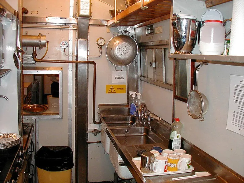
Photo: John Lucas , CC BY-SA 2.0, via Wikimedia Commons
The kitchen is the hardest-working room in the house, and the one place where a colour scheme has to earn its keep. A bedroom can get away with a mood; a kitchen has to cope with steam from the kettle, splashes from the sink, a film of oil after a Sunday roast and the slow accumulation of everyday cooking. That is why a palette that looks crisp in a sample pot can feel greasy, tired or simply gloomy by February. The answer is not to choose a boring colour. It is to choose a working palette: shades and finishes that suit the room's job as well as its light.
Start with what lands on the surfaces
Most kitchen colour advice starts with the look. A better starting point is the list of things that will land on your walls and cupboards: condensation, tea, tomato sauce, coffee, cooking oil and, yes, sausage fat. Some colours wear those marks more gracefully than others. Brilliant white can show every splatter. Pale chalky shades can look grubby around handles and hobs. Very dark colours can hide marks but may turn a north-facing kitchen into a cave in winter. Mid-tone colours, warm neutrals and gentle greens tend to be more forgiving, especially when the finish is wipeable. This is not an argument for dullness. It is an argument for depth.
The finish does half the work
You can fall in love with a colour and then undermine it with the wrong paint. In a kitchen, finish matters as much as hue. Flat matt emulsion behind a hob is a mistake; it is difficult to clean and will show every airborne oil particle. For walls in cooking zones, look for a scrubbable matt or a moisture-resistant kitchen paint. For cupboard doors and trim, a water-based eggshell or satin is usually a better bet: it is more durable and can be wiped without dulling. Splash zones need a surface that can take repeated cleaning, whether that is tiles, glass, a painted upstand in eggshell or a glossier finish. Even the ceiling deserves a moisture-resistant matt rather than standard emulsion. If you want a chalky, flat look, keep it for low-traffic walls away from the hob and sink.
Walls, cupboards and the splash zone
Treat the kitchen as three planes rather than one block of colour. Walls set the background; cupboards carry the personality; the splash zone is the bridge. A warm off-white or oatmeal wall in a scrubbable matt gives you a calm base. Cabinets can take a stronger shade, such as soft sage, olive, clay or a muted blue-grey, in eggshell. Lower cabinets in a deeper colour can hide scuffs from feet and bags, while upper cabinets in a lighter tone keep the room from feeling top-heavy. The splashback can match the wall for a quiet look or introduce a third colour that ties the room together. What it should not be is an afterthought in standard emulsion.
Zone the palette without building a showroom
Showroom kitchens often look effortless because they are staged: no kettle, no bin, no slightly tired grout, no child's cup left on the worktop. In a real home, a palette needs to work with clutter and daily life. The simplest approach is a three-part rule: one base colour for walls and ceiling, one workhorse colour for cabinetry, and one accent for the splashback, trim or a single painted detail. Repeat the workhorse colour somewhere else, perhaps on the trim or a shelf, so the scheme feels intentional rather than accidental. Avoid adding a fourth colour just because you like it. In a small British kitchen, restraint usually reads as confidence.
Why February changes everything
British light is not a constant. A colour that feels fresh in spring can look cold and grey in January, especially in a north-facing kitchen or a room with a small window. Add steam, condensation and a thin film of cooking oil, and pale colours can lose their crispness quickly. Warm undertones, mid-tones and finishes with a slight sheen often hold their nerve better than icy whites or cool greys. Deep colours can be beautiful, but they need testing in the actual room; in low light they can close in, and near a hob they can show every fingerprint. The goal is a palette that still looks deliberate on a wet Tuesday in February, not just on the day you paint it.
A practical testing routine
Paint large sample boards rather than small patches. Put one beside the hob, one near the window and one next to the cupboard you use most. Leave them for at least a week, ideally two, and look at them in morning light, evening light and with the kitchen lights on. Wipe them with a damp cloth as you would a real wall. If possible, test the same finish you plan to use, because matt and eggshell read differently. A colour that looks perfect on a dry patch of plaster may feel quite different once it is covering a whole wall behind a steaming pan.
The shortlist
For walls, warm off-white, oatmeal and soft stone are reliable in scrubbable matt. For cabinets, sage, olive, clay and muted blue-grey work well in eggshell and hide everyday marks without feeling heavy. For splash zones, match the wall or use a deeper version of the cabinet colour in a wipeable finish. Avoid brilliant white directly behind the hob, flat matt in splash areas and very dark shades in kitchens that never get direct sun. The best kitchen palette is not the one that photographs best. It is the one that still looks considered after the sausages have spat, the kettle has boiled and February has arrived.