Rain, Algae and Low Light: How to Choose Exterior Colour for the Long Term
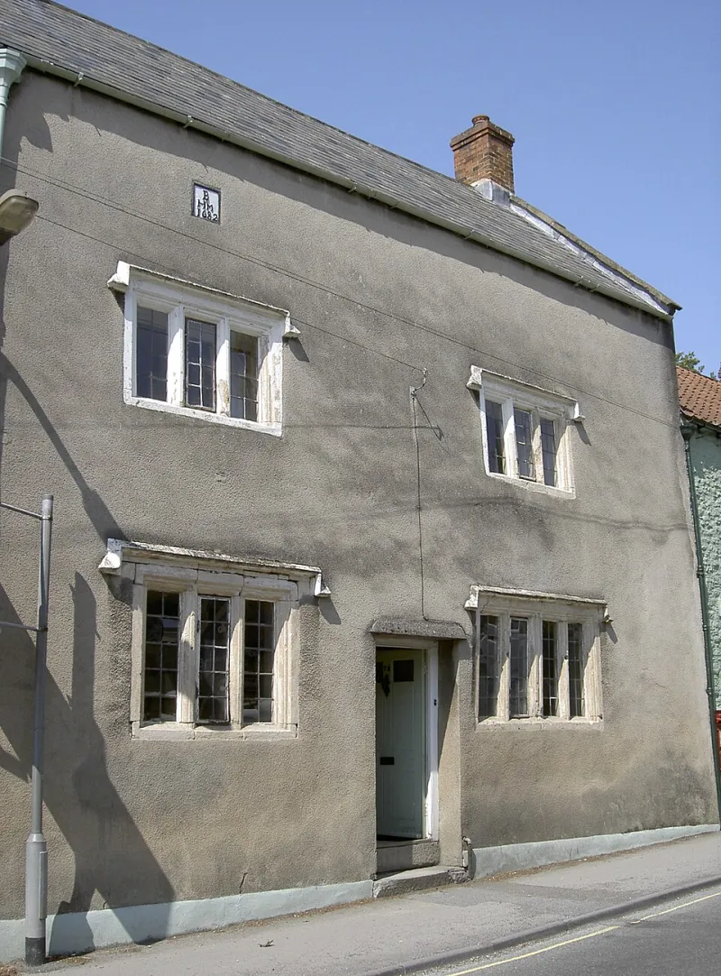
Photo: Neil Owen , CC BY-SA 2.0, via Wikimedia Commons
November is when exterior paint stops being a mood board and starts being a maintenance item. The front of the house that looked charming in May — soft grey render, brilliant white trim, a glossy black door — can be a different proposition after weeks of drizzle, a couple of frosts and the sort of flat, pewter light that makes every undertone show up. By late winter, you are not looking at a colour scheme any more. You are looking at how it copes.
That is the long game with exterior colour in Britain. The goal is not a facade that photographs well in June. It is one that still looks deliberate when the gutter is dripping and the path is slick.
Spring flatters; late winter tells the truth
Sunlight at a low angle is unforgiving. A cool grey with a blue undertone can read almost navy on a wet north wall, while a cream that felt warm in June can look faintly green against damp paving. Algae is the real colourist here: it creeps across shaded elevations and turns a crisp pale wall into something patchy and tired.
Fashionable exterior shades often fail because they are chosen in the wrong conditions. Charcoal render, mushroom-toned masonry and stark black trim can look sharp on a dry day. On a wet wall in February, they can look heavy, streaky or simply muddy. That does not mean you cannot use them. It means you need to choose the exact tone with the British weather in mind, not just the trend cycle.
Render: breathability before colour
Most exterior problems start behind the paint, not in it. Render needs to let moisture out. If you seal a wall with a high-build, low-breathability coating, trapped damp will find another way out — often through blistering, flaking or patches of green-black algae that keep returning.
Lime render is the obvious case. It wants a breathable mineral paint or limewash, not a plastic-feeling shell. Cement render and pebbledash are more forgiving, but a microporous masonry paint is still the sensible default. Preparation matters as much as the tin: treat algae properly, fix leaking gutters, and never paint over damp.
Colour-wise, large elevations tend to hold mid-tones better than extremes. Very dark colours can look dramatic, but on a sun-starved wall they show every smear and repair. Very pale colours can go chalky and show dirt. Warm stone, muted clay, soft olive and gentle slate blues are more forgiving. Keep soffits and reveals a shade lighter if you want the wall to feel less heavy.
Brick and garden walls: work with the weather
Unpainted brick is usually best left alone. It has spent decades dealing with British rain and frost, and a painted brick wall is a long-term commitment. If the brick is already painted, use a breathable masonry paint and do not skip the preparation. A colour that relates to the mortar, roof and neighbouring brick will age more gracefully than one that tries to erase the building's history.
Garden walls are their own test bed. They get frost, moss, splashes from borders and the white salt bloom known as efflorescence. Dark garden walls can look smart, but they show every bloom and water mark. Mid-tone clay, olive or warm stone is more forgiving and still looks intentional. If the wall is old and lime-based, breathability is non-negotiable.
Trim, doors and the sheen question
Trim is where sheen earns its keep. Matt finishes look chalky outside and hold dirt. Satin or eggshell on window frames and fascias wipes down more easily; gloss on a front door gives a crisp, traditional finish and sheds rain well. The mistake is using high gloss on imperfect render or old joinery — it highlights every lump and crack.
Pure brilliant white is tempting, but it can yellow, chalk and look brittle against wet skies. An off-white with a little warmth is usually more forgiving. Black trim looks sharp in photographs but shows dust, pollen and water marks. If you want contrast, a soft charcoal or deep green is often kinder than jet black.
Build a palette in three layers
A reliable exterior scheme has three jobs: the base, the structure and the accent. The walls do most of the work, so choose a colour you can live with at scale. Trim should relate to the walls rather than fight them. The front door or gate can be the one place where a stronger colour earns its moment.
Do not introduce four colours on a small facade. Look at the pavement, the neighbouring houses and the roof. An exterior colour is never seen alone. It is seen in a street, in weather, in context.
Shades that tend to settle in
Muted clay, warm stone, olive, slate blue, soft off-white and deep green are not the most exciting colours on a swatch. They are the ones that tend to look convincing at scale. They have enough pigment to hold their own in low light, but not so much that every patch of algae or frost becomes a feature.
Stark contrast between wall and trim is harder to carry off than it looks. If the architecture is plain, keep the contrast gentle. If the house has good details, let the trim quietly frame them rather than shout over them.
Test it wet, not just dry
Paint large boards and fix them to different elevations. Look at them in rain, at dusk and in the flat light of a wet weekend. Check a north wall and a south wall — they will not behave the same way. If you can, wait for a proper wet week before committing.
The best exterior colours are not the ones that look best on the day they go on. They are the ones that still look deliberate months later, when the weather has done its worst. Choose for the long haul and the rest of the year tends to look after itself.