The Blank Wall Isn't Neutral: Rethinking Dark Colour in Small UK Flats

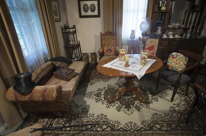
Photo: Christine Johnstone , CC BY-SA 2.0, via Wikimedia Commons
Walk into almost any small flat for sale or rent in Britain and you will meet the same wall: a thin, slightly blue-white emulsion, applied in a hurry, doing no one any favours. It is meant to read as neutral. In practice it often reads as temporary. The white box has become the default because it is safe, cheap and easy to photograph. But safe is not the same as generous.
A small room painted white does not automatically become larger. It becomes brighter, which is not the same thing. White reflects what light it receives, so a north-facing room with one sash window can end up looking chalky and shadowless, while every lump, crack and uneven corner is picked out by the contrast between wall and trim. Deep colour does something different: it absorbs light, softens edges and gives a room a boundary. In a compact flat, that boundary can feel more comfortable than an endless pale void.
Light direction matters more than square footage
The first question is not 'how dark can I go?' but 'where does the light come from?' A north-facing living room gets cool, indirect light for most of the day. Cool whites and grey-based paints turn it colder still. A warm, muddy colour — olive with a yellow base, a soft bronze, a clay-inflected pink — will soak up that grey light and reflect something kinder back. South-facing rooms can take cooler colours: ink blue, forest green, a smoky aubergine. East-facing rooms often feel blue in the morning and golden later; choose a colour that looks good in both, such as a green with a brown undertone rather than a sharp emerald.
In period conversions, light is rarely even. Bay windows, boxed-in pipes and sloping ceilings create pockets of gloom. A dark colour on the walls can make those pockets look deliberate rather than defective. It also hides the visual clutter of radiators, meters and badly aligned cornices. This is not about pretending a small flat is a grand salon. It is about giving the eye somewhere to rest.
Undertones do the heavy lifting
The fear with dark paint is that it will make a room feel like a cave. Usually, the problem is not the depth but the undertone. A deep grey with a blue base in a north-facing room will feel icy. A deep grey with a green or brown base will feel enveloping. A near-black with red in it can be warm; a near-black with green can be severe. Test the colour against the room's fixed elements — the floor, the window frame, the kitchen cabinets — before committing. If the floor is orange-toned pine, a cool mauve will fight it. If the floor is grey laminate, a warm ochre will make it look less sterile.
One useful rule for small rooms: choose a colour that looks slightly dirty in the tin. Clean, saturated colours can be wonderful in large, well-lit spaces, but in a compact flat they often look like a statement rather than a room. Muddier tones — olive, bronze, clay, slate — have more give in them. They change through the day and forgive the fact that your living room is also your dining room and your home office.
The ceiling is not automatically white
British decorating tradition loves a white ceiling, but a bright white ceiling in a room with low ceilings creates a hard line at the top of the wall. That line draws attention to the height you do not have. Painting the ceiling the same colour as the walls, or a lighter tint of it, blurs the junction and makes the room feel more like a single volume. In a low box room, a mid-tone blue-grey on walls and ceiling can feel calmer than white walls with a white ceiling and a dark floor.
This does not mean every ceiling must be dark. If the ceiling is structurally low and the room is north-facing, a very deep ceiling can feel heavy. A lighter tint of the wall colour — half the strength — keeps the drenched effect without pressing down. In a period conversion with sloping ceilings, paint the slope and the wall below it the same colour; the change in plane will read as architecture rather than an accident.
Trim, sheen and the outline problem
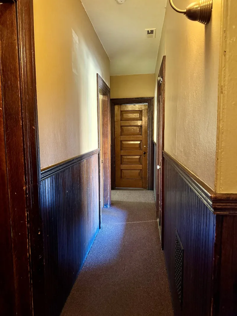
White skirting and white door frames are the default in British flats, but they create outlines. In a small room, every outline is another edge competing for attention. Painting trim the same colour as the walls, or one shade darker, makes the room read as a whole. It is especially effective in hallways and box rooms where there is not much architectural detail worth highlighting.
Sheen matters as much as hue. Chalky matt emulsion is fashionable, but it marks easily in rented flats and small family homes. A low-sheen washable matt or a soft eggshell on walls gives depth without the fragility. For woodwork, a mid-sheen eggshell is practical and looks intentional. Avoid high gloss on uneven Victorian plaster unless you enjoy seeing every repair.
Three starting points
For a north-facing small living room: walls in a warm olive with a yellow-brown base, ceiling in a lighter tint of the same, woodwork in a deeper olive eggshell. Add a soft apricot lamp glow rather than cool white bulbs.
For a low-ceilinged box room: walls and ceiling in a mid-tone blue-grey with a touch of green, skirting in the same colour, floor in a warm rug. The lack of contrast at the ceiling line does the work.
For a period conversion with odd angles: walls in a deep clay or muted terracotta, alcoves in the same colour, ceiling in a soft plaster pink. The warm tones make the awkward shapes look like part of the plan.
Test it where it lives
Do not choose a dark colour from a tiny chip under shop lighting. Paint a large patch — at least A3, ideally bigger — on two walls that receive different light. Look at it in the morning, at dusk and with the lamps on. Check it against your sofa, your floor and your kitchen cupboards. If it looks too heavy, try a lighter tint rather than abandoning the idea. If it looks flat, try a different undertone. The right dark colour in a small flat does not feel cramped. It feels considered — and considerably more generous than another white box.