The Pavement View: Front Door Colours That Age Well in Britain
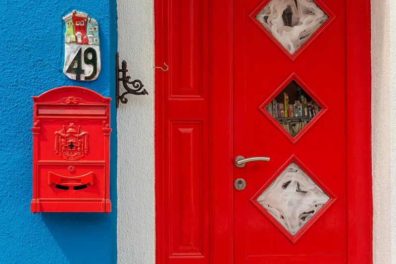
Photo: Marco Ober, CC BY-SA 4.0, via Wikimedia Commons
Front doors are odd things. They are the smallest painted surface on most houses and the one everybody sees first. A hallway can be a work in progress, the windows can need a clean and the bin store can be doing its best, but the front door is the bit that gets read from the pavement in about three seconds. That is why front-door colour needs a different sort of scrutiny from interior paint. It is not just about whether you like the shade. It is about whether the shade likes your brick, your street, your weather and your ability to prep a door properly on a cold Saturday.
Start with the street, not the swatch
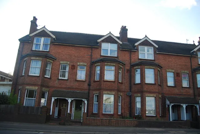
Stand on the pavement opposite your house. Look at the whole terrace or row, not just your number. A door colour that looks superb in isolation can look shouty in a street of soft whites, or washed out beside a run of glossy black doors. There is no rule that says you must blend in, but it helps to know what you are rebelling against.
Also check which way the front faces. A north-facing facade spends much of the year in cool, flat light, so colours read greyer and darker than they do in a sunny paint shop. South-facing fronts can carry stronger shades without turning into a black hole. East and west elevations shift through the day, which is why a door can look perfect at 10am and slightly wrong by teatime.
Six shades that tend to hold their own
These are not the only good front-door colours, but they are reliable starting points for British homes.
- Deep olive or khaki. Softer than forest green and kinder to red brick than a hard emerald. It looks considered without demanding a round of applause.
- Muted navy. A classic for a reason. It flatters white render, pale stone and Victorian terraces, but avoid anything too bright or it starts to look like a school blazer.
- Oxblood or burgundy. Rich without being loud. Excellent on period properties, especially where there is already red brick or warm stone nearby.
- Forest green. Strong, traditional and very good on Georgian and Victorian fronts. In a north-facing position it can go almost black, so check it in situ.
- Warm off-black or charcoal. Smarter than pure black and more forgiving than a hard jet. It suits everything from cottages to semis, provided the trim is kept crisp.
- Dusty blue or soft teal. A gentler option for rendered houses and coastal streets. It can look lovely with grey uPVC windows, but test it against the window colour first.
Brick, render, stone and uPVC
Red brick usually likes green, navy, off-black and oxblood. Buff or yellow brick can handle blues, greens and soft clay tones. White render is the easiest backdrop and can take a bolder door, while stone is best treated with a little restraint: muted greens, deep blues and warm blacks tend to sit well.
If you have a uPVC door, check the manufacturer's guidance before you buy paint. Some can be painted with the right specialist system, many cannot, and a composite door may need a different approach again. Do not assume a tin of exterior gloss will stick to plastic and stay there. The same goes for door furniture: brass, chrome and black hardware all change how the colour reads.
Weather, orientation and the February test
A front door in Britain has to survive wind-driven rain, UV, road grime and the sort of damp cold that finds every edge. Dark colours can show water marks and dust. Pale colours can show mud splashes and street dirt. There is no magic shade that stays pristine, so choose a finish you can live with and clean.
Exterior satin or eggshell is often a practical choice for modern doors, while traditional gloss gives a period front a sharper look. Gloss shows imperfections in the door surface; satin hides more. If the door faces the worst of the weather, think about how it will look after a few months, not just on the day you finish painting it. A colour that still looks intentional in February is worth more than one that only works in July.
Prep and finish: the bit that stops it looking DIY
A rushed prep job will make any colour look tired. Clean the door thoroughly, sand where needed, fill and repair, then use the correct primer for the surface. Avoid painting in cold, damp conditions, and read the tin for drying times rather than guessing. Remove hardware or mask it properly. Two thin coats usually beat one thick coat. If the door has glass, take your time with the edges.
A front door is a small area, so people often try to do it in an afternoon. That is exactly how you end up with brush marks, drips and a colour that looks like a mistake. Give it a full day, ideally two, and the difference will show from the pavement.
The final audit
Before you commit, paint a large sample board and hold it against the door at different times of day. Take a photo from the pavement, then look at it again in the evening. Check it beside the window frames, the brickwork and the neighbour's door. If it looks calm and deliberate, you are probably onto something. If you have to convince yourself, keep looking. The best front-door colours do not just suit the door. They make the whole house look as if someone has been paying attention.