Lamplight Doesn't Lie: Choosing Paint for the Hours After Daylight

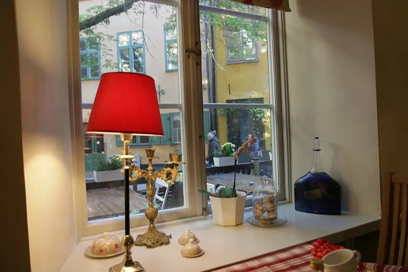
Photo: Evelyn Simak, CC BY-SA 2.0, via Wikimedia Commons
There is a specific moment in a British winter when a room changes its mind about you. The curtains are still open, the sky has gone the colour of a dishwater puddle, and someone reaches for the light switch. It is usually about four o'clock. The wall you chose in July — the one that looked soft and chalky in the garden light — suddenly reads grey, or green, or faintly bruised. Nothing has changed except the lighting, but the room feels like a different room.
That is the 4pm problem, and it is worth taking seriously. For roughly five months of the year, most of us use our homes mainly under lamps rather than daylight. If you choose paint at midday and never revisit it after dark, you are decorating for a version of your life that only exists between April and September.
Why walls change shift at four o'clock
Daylight is a broad, relatively even source. It flatters almost everything, which is why paint companies love a north-facing window and a bit of soft cloud. Artificial light is fussier. It has a colour temperature, usually described in kelvin, and that temperature pushes colours in a particular direction.
A warm LED at around 2700K — the standard "warm white" in most UK living rooms — leans yellow-orange. It enriches reds, terracottas and creams, but it can turn a cool grey faintly khaki and make a sharp white look like old emulsion. A cooler bulb at 4000K or above does the opposite: it flattens warm colours, pulls the green out of taupes, and makes blues and greys look cleaner and colder. Then there is the awkward middle ground of mixed lighting, where a warm pendant, a cool downlight and a table lamp all argue over the same wall.
There is also the question of colour rendering. Cheap bulbs with a low CRI — colour rendering index — make everything look slightly dull and unappetising, a bit like viewing your room through a smeared window. You do not need laboratory-grade lighting, but it is worth buying bulbs that render colour decently, especially in rooms where you actually spend time.
The three-lamp problem
Most homes do not have one lighting scheme. They have an accidental collection: a ceiling pendant inherited from the previous owner, a couple of GU10 spots, a floor lamp with a linen shade, maybe a candle bulb in a corner. Each pool of light has its own temperature and intensity. A colour does not need to look identical under all of them, but it does need to avoid looking actively wrong under any of them.
The worst outcome is a wall that looks pleasant under the main light and slightly grubby under the lamp you use every evening. That is usually a sign that the undertone is fighting the bulb, rather than a sign that the colour itself is bad.
Hallways: the first impression after dark
Hallways are the purest version of the problem. Many have little or no natural light, and they are used at 7am and 6pm — both dark, both reliant on whatever bulb is in the ceiling. A cool grey that looked smart in the paint shop can turn dingy under a warm bulb, while a strong yellow-based neutral can make everyone look faintly jaundiced as they put their shoes on.
Mid-tone colours tend to hold their nerve better than either extreme. A soft greige, a muted olive, a gentle clay or a dusty pink will still read as itself under a warm lamp. Very pale colours can wash out, and very dark colours can collapse into a black hole in a narrow corridor. If you want a dark hallway, go for it — but test it at night with the actual bulb, not just in daylight.
Living rooms: where dimmers earn their keep
Living rooms are usually the most forgiving, because they have layers of light and often a dimmer. But dimming changes colour. As a warm LED is turned down, it tends to become warmer still — richer, more amber, more candle-like. Deep colours can go muddy; pale colours can go creamy and lose their crispness.
A colour that works beautifully at full brightness can look slightly soupy at 30%. Test your sample boards at the level you actually use in the evening, not just with the switch at maximum. And pay attention to lampshades: a linen shade diffuses light softly, while a bare bulb or a clear glass shade throws it around more harshly. The same wall can look entirely different under the two.
Bedrooms: close-up light, close-up colour
Bedrooms are lit differently again. You are often lying down, with a lamp close to the wall, and the light is low and local. Colours look more saturated in that pool of light. Muted greens can go grey, soft pinks can go peachy, and pale blues can look almost chalky.
The test is simple: put your sample board next to the bed, turn on the bedside lamp, and look at it from pillow height. If it looks calm and pleasant there, it will probably behave. If it looks like a hospital corridor or a nightclub, reconsider.
A practical evening-testing method
You do not need a colour consultant. You need a weekend, a couple of A2 boards and a bit of honesty about how you actually live.
Paint two coats onto the boards, using the finish you intend to use on the wall. Small swatches are useless for this — they do not give you enough colour to judge. Leave the boards in the room for a few days so you stop seeing them as objects and start seeing them as walls.
Then test at four different times: 8am, 4pm, 6pm and 9pm. At each point, note what the light is doing. Is the main light on? The lamps? The dimmer? Take a photo, but do not trust the photo completely — cameras adjust white balance and flatter colours in ways your eye does not.
Move the boards around the room. A colour that looks good on the chimney breast may look worse in the corner where the light pools. Look at it from the doorway, because that is how you will see it most often. And compare it against a plain white piece of paper or a grey card, so you can see whether the colour is shifting warm or cool.
Finally, test it with the bulbs you actually own. Not the ones you think you should own. If your hallway has a slightly grim cool-white bulb, put that bulb in the lamp and see what happens. The aim is not to create a perfect lighting scheme; it is to make sure the paint does not unravel under the one you have.
The colours that tend to behave
Warm neutrals, soft greiges, muted greens, gentle clays, and deep blues with a touch of green tend to survive the evening shift. They have enough pigment to hold their identity without becoming loud under a lamp. Sharp cool greys, lilacs, bright yellows and very white whites are more vulnerable — not impossible, just less forgiving.
Think of it as building a small library of light conditions, which is rather the point of a paint library. A colour is not a single fixed thing. It is a behaviour, and it behaves differently at 8am and 8pm.
The 4pm problem is not really a warning against colour. It is a reminder that the hours you actually live in are the ones worth decorating for. Choose a paint that holds its nerve when the sun clocks off, and your room will feel finished all winter — not just on the days when the light does the work for you.