North-Facing Doesn't Mean Beige: Why Cool Colours Hold Their Nerve in British Light
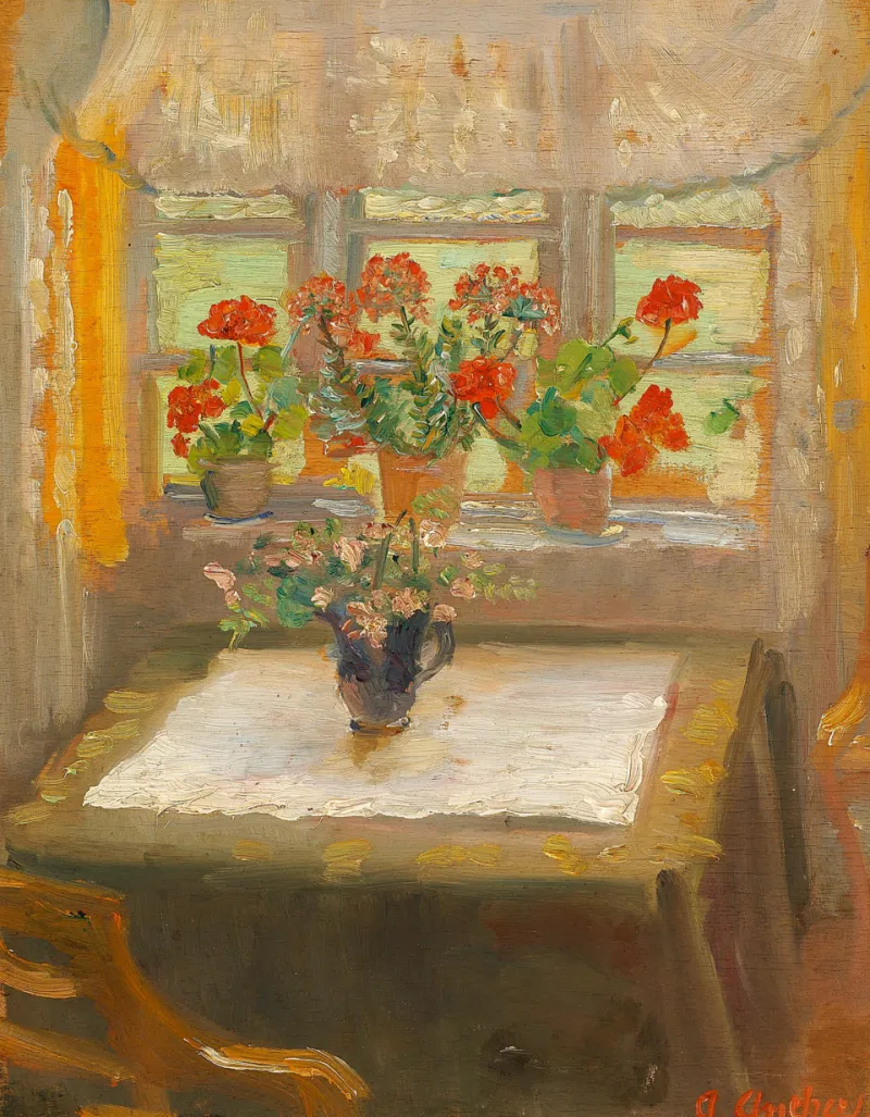
Photo: Anna Ancher, Public domain, via Wikimedia Commons
We have all had the conversation. You mention that the front room faces north and someone — a builder, a parent, a stranger in the paint aisle — says the same three words: warm it up. Cream. Peach. A nice soft yellow. And so another north-facing Victorian front room gets painted the colour of a hotel corridor, and another homeowner sits in it at four in the afternoon in November, unable to say why the whole thing feels faintly wrong.
The advice is not wrong, it is just tired
Warm colours do lift cool light. That part is true, and nobody is disputing it. The problem is what happens to a correction after forty years of repetition: it hardens into a rule, and a rule applied without thinking turns into beige.
Here is the thing the rule ignores. Most north-facing rooms in Britain are not gloomy because of the compass. They are gloomy because of a 1.2m sash, a net curtain that never comes down, a bay that catches no direct sun at any point in the year, a terrace opposite, a mature sycamore two gardens over, and a ceiling that has been the same colour as the walls since 1994. Painting that room peach does not solve any of it. It just makes the gloom warmer.
What northern light actually does to a wall
North light is diffuse, cool and remarkably steady. It does not throw bright patches about that make a room feel alive; it flattens. What it does do, more than any other aspect, is reveal undertone.
Yellow-based creams go faintly acidic by mid-afternoon. Peaches pick up a greyish cast the moment the sun drops behind the houses opposite. A warm white with a pink undertone can read almost lilac under a cheap LED at eight in the evening — this is the one that makes people say the room feels ill, and they are not imagining it.
Cool colours behave differently under the same conditions. They sit close to the chip on a flat grey Tuesday and go quietly luminous on a bright morning in May. A chalky grey-blue does not need rescuing at 4pm, because it was never pretending to be sunlight in the first place.
Undertone, not temperature
Cool is not one colour, which is where most of the argument goes wrong. There is blue with green in it, blue with violet, grey with blue, green with grey. North light pulls the blue and violet forward and calms the green.
A green-based blue or a blue-based grey reads chalky and steady under northern light. Both look deliberate rather than cold. The one to treat with care is a cool shade with a strong violet undertone — that is the colour that goes grey-lilac under warm bulbs and never quite recovers.
The bit about bulbs that nobody mentions
Almost every British home runs warm white LEDs somewhere around 2700K. Under that light, a cool blue-grey wall turns muddy and a strong teal goes flat. This is not a reason to avoid cool colours; it is a reason to fix the lighting.
Aim for 3000K to 4000K in a north-facing room, with a colour rendering index of 90 or above. Then layer it. A floor lamp at roughly 1.4m, a picture light, a table lamp on a sideboard — three small sources at different heights will do more for a cool-walled room than any single pendant ever will. And check your tester at eight in the evening with those lamps on, not only at noon on a Sunday.
Do not stop at the architrave
Colour does not end at the door frame. If the hallway is a warm off-white and the front room is a cool grey-blue, the doorway becomes a visible seam, and the cool room reads colder than it is because it is being compared to something yellow.
Two options. Repeat one colour across both spaces — the hall and the front room in the same chalky grey-green, with the woodwork a shade lighter — so the eye reads one continuous volume. Or make the change deliberate: keep the hall warm, and frame the doorway with a trim colour strong enough that the shift looks like a decision rather than a mistake.
Three palettes worth testing
1. The Victorian front room
Walls in a soft grey-blue, chalky rather than clear. Woodwork in an off-white with a drop of black in it — not brilliant white, which reads sharp and slightly municipal against a cool wall. Ceiling either the wall colour at half strength or the same grey-blue, because ceiling white against a cool wall creates a hard edge that draws the eye upward to the darkest part of the room. Warm it back with brass, walnut and a rug with some rust in it.
2. The small conversion flat
Walls in a mid sage-green with plenty of grey in it, and one wall — usually the one you face from the sofa — in a deeper version of the same green. Contrast should come from depth, not from accessories, in a small room. Keep the ceiling pale and the skirting the same as the wall to stop the room being chopped into horizontal bands.
3. The north kitchen-diner
Walls in a cool putty grey, units in off-black or a deep forest green if you are feeling brave, splashback in a plain mid-grey tile rather than white. Avoid yellow-toned oak next to cool walls; it fights. Pale ash, painted timber or a warm-grey worktop will agree with the scheme far better.
Testing it properly
Two coats on A2 boards, not a splodge behind the sofa. Move the boards around: morning by the window, afternoon on the chimney breast, evening under the lamp with the curtain shut. Look at each one next to a sheet of white paper, then next to your flooring and your sofa. If a colour holds up at 8am and again at 8pm, it will be fine in July.
The short version
Warm colours are not banned, and cream has its place. But if someone told you to warm up a north-facing room and your instinct said no, your instinct was probably reading the light more accurately than the rule was. Cool colour is not a compromise in British northern light. Handled properly, it is the thing that finally makes the room look like itself.